

How split toning works
(UPDATE Dec 2020) Lightroom has recently changed how split toning looks in Lightroom. The split toning panel is now called Color Grading. Everything functions the same, but just looks a little different. There is also now the ability to add color into the mid tones - amazing! Everything below still applies, the screenshots are just now out of date.)
The ‘ah-ha’ moment when learning something new just feels so good. You know what I mean. Photographers, if you can, to remember a few of your own. Maybe when you first shot with some fast glass and had your subject pop wonderfully from the background, or when you finally got a grasp on shooting in manual and felt like a light ninja. Perhaps it was when you first tried out some good presets, or had someone explain something in Lightroom to you.
Discovering split toning is often one of those big ‘ah-ha’ moments for photographers. Split toning is powerful and can add a level of sophistication and uniqueness to your photos. It’s an amazing way to distinguish your work from others and create images that look like your own.
However, split toning can seem a bit unknown, intimidating and hard to use. It’s often left dusty and untouched in our Lightroom panels. So let’s change that and dive into how to use it.
What is Split Toning
Split toning is a Lightroom tool that splits your images information into its highlights and shadows and then allows you to place colour/tone into each section independently. It is a powerful way to create a distinctive look, or adjust how to white balance feels, or adjust skin tones independent of the rest of the image - the options are endless. Some presets use split toning, but in my opinion, most don’t take full advantage of split toning as it is something that can often look too strong.
Split toning is a technique that has been around a long time and has a long history in black and white film photography - of course. But we don’t need to dive into that right now, let’s just make sure you get that split toning is:
Injecting tone into the highlights of your image.
Injecting tone into the shadows of your image.

The image on the left is a plain black and white gradient that moves from Blacks to Shadow to Highlights to Whites. You see on the right that you can add colour or tone separately to the Shadows and to the Highlights. In this case blue to the shadow and yellow to the highlights. Obviously this is an extreme example and you would rarely want to such a strong look but let’s continue.
Colour Theory
By now you may be tempted to go crazy and mess with your split toning a whole lot. Go for it! And when you are done and over it, let’s sit down and look at a little colour theory to help us use it better. Because a couple of theory basics can go along way here.
Basic colour theory asserts that complementary colours are ones that sit directly opposite each other on the colour wheel. So, red and green, violet and yellow, orange and blue etc. Complimentary colours used in split toning help give a contrast to the image as the colours are opposites to each other.
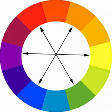
A classic use of split toning in film is the combination of orange and blue. Complimentary colours that are widely used - begin to notice it and you’ll see it everywhere. Blue placed into the shadows, and orange/yellow placed into the highlight to emphasis the skin tone. In fact, this combination is often used to correct hard to correct white balances to get the skin tone feeling just right.

How to apply split toning
You’ll find Lightroom intuitive enough to be able to play around with your split toning panel but here are a few basics.
You have two sliders (hue and saturation) for each the highlights and the shadows. Plus a slider to control the overall balance between the two. Sometimes you may want tone only in your highlights, or shadows - you don’t always need to do both.
Firstly, simply move the hue slider until you can find the hue that you are looking for. If you hold down alt (Windows) or option (Mac) when doing this will get a little preview at 100% saturation. This is too strong but it will help you choose your colour/tone.
When you are all happy with your hue, use the saturation slider to change the strength to a level that you like. This is something that will change from image to image and you’ll find yourself changing the most.

Hopefully by now you’ll have some confidence to go and have a play with your split toning panel. It can be a steep learning curve, but start by looks at photographs you like and trying to analyze what they are doing with the split toning. Then try that out on your own photos.
Using split toning as a finisher
Split toning should not be the basis of your edit, it will most likely look to strong. However, it is a powerful way to give a cohesive look across a set of images. So I like to think of split toning is as a finisher to my edits. Get your edit as good as you can by adjusting the WB sliders and getting your colours how you like and then go to your split toning panel and play around. This can mean you go back to your WB sliders again, but you won’t be relying on the split toning for your look. This way you’ll get more consistent colours across your set.
Both of these images below show no split toning on the left and split tone added on the right.
This is using our classic combination of a little blue in the highlights which tones down the skin tones, and some yellow in the shadows to warm up the image.


Split toning applied on the images on the right
It’s really easy to over do your split toning. I would suggest not going above 20% saturation unless you are going for a really out there look. But the possibilities with split toning are endless so go and have a play.
See more from the journal here:


